Just the Facts
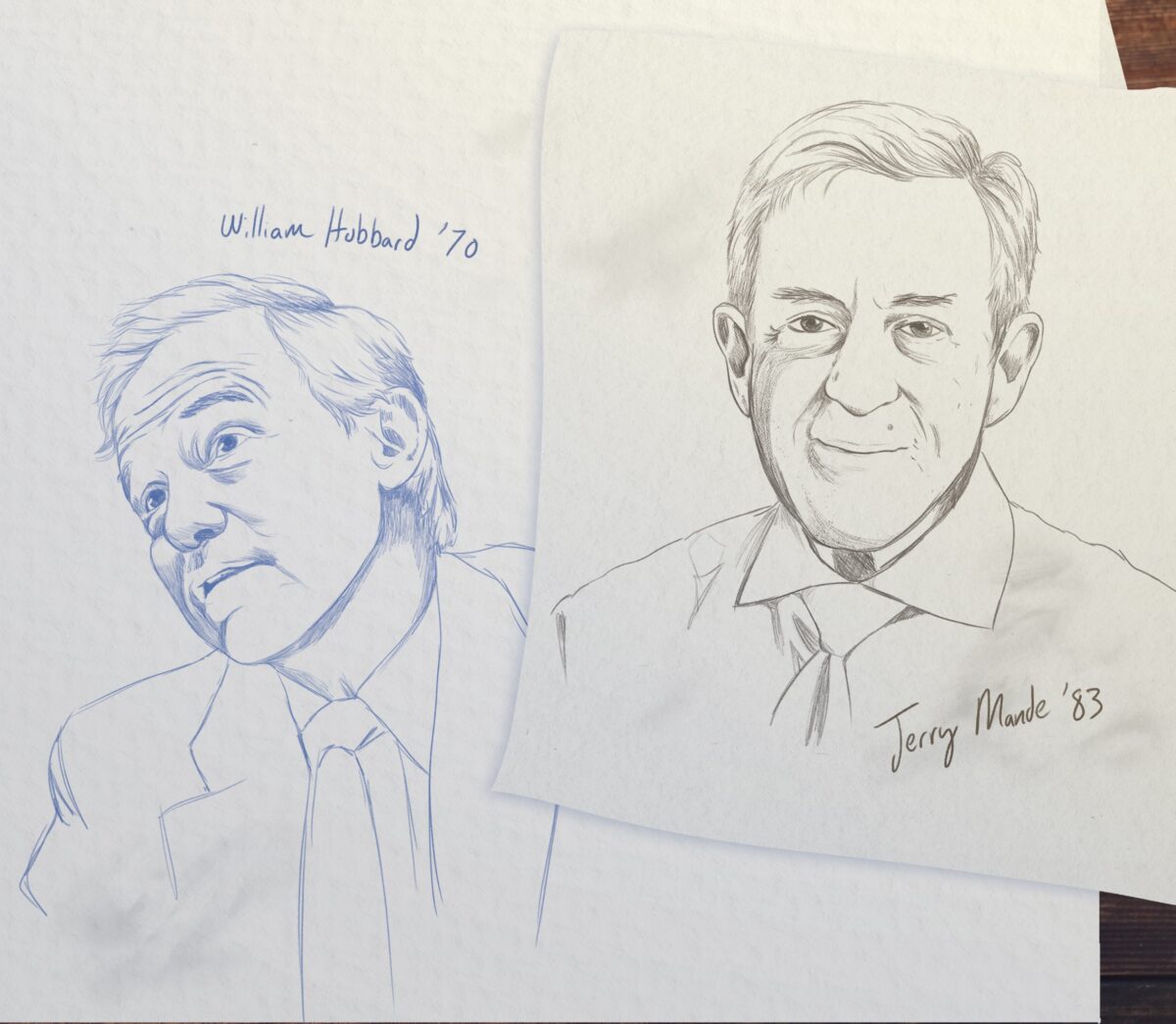
William Hubbard ’70 brought the political savvy.
Jerry Mande ’83 (MPH) the design expertise.
Together they created the iconic nutritional food label shoppers have come to count on.
by George Spencer
Andy Warhol never met William Hubbard ’70 or Jerry Mande ’83 (MPH). But the pop artist who turned soup can labels into art might have admired the uber-ubiquitous, award-winning “Nutrition Facts” food label the two alumni created. Their iconic and often-imitated design had an extravagant goal — to prevent illness and save health care spending. It has arguably been seen billions of times, more often than almost anything any artist has created.
Both men worked at the Food and Drug Administration where they teamed up in the early 1990s to create the label that appears on tens of thousands of food products, replacing a hodge-podge of less informative ones. “They had very different skill sets and styles,” recalled David Kessler, the FDA commissioner at the time who attracted media attention by taking on the powerful tobacco industry while overseeing the food label’s design process. “Had it not been for their efforts, we would not have the current food label. Jerry was an intellectual giant, a visionary about how the label should look, and Bill knew how to navigate every governmental hurdle. No one could execute the way he could.”
They were an unlikely duo. Hubbard, now 74, was an associate commissioner for policy and a master at behind-the-scenes policy making. The son of a railroad engineer, this self-effacing strategist grew up in Rocky Mount and worked his way up the government ladder, starting as a messenger and elevator operator in Congress.
Mande, now 69, a fanatic for stellar graphic design, was raised in tony Westport, Connecticut. After studying art at the University of Connecticut, he earned his master’s of public health at UNC and worked as a senior legislative aide to then-Sen. Al Gore before joining the FDA as a policy analyst and swiftly rising to executive assistant to the commissioner.
Their achievement 30 years ago combined the dogged pursuit of design perfection with an unrelenting zeal for achieving policy goals. They faced a stiff deadline, a complex design crammed with dozens of data points and formidable opposition from the U.S. Department of Agriculture. Everything came down to a tense last-minute White House meeting with President George H.W. Bush that could have dashed Hubbard’s and Mande’s work.
“The Nutrition Facts label was a huge step forward in providing people with information they could use to improve their lives,” said Hubbard, a history and American studies major at Carolina who now lives in Chapel Hill.
“There needs to be a label”
Five thousand pages. One of the lengthiest and most complex rulemaking efforts in U.S. government history. That’s how massive and detailed the food-labeling rules became in 1992 after FDA regulators interpreted the intent of the Nutrition Labeling and Education Act, which Congress passed in November 1990. Louis Sullivan, then-secretary of the Department of Health and Human Services, had sparked the creation of the legislation in 1989 by denouncing the plethora of existing U.S. food labels as a “tower of Babel.”
Throughout the 20th century, regulators, health advocates and the food industry waged a tug of war over how much information to provide shoppers. The government originally saw its regulatory mission as preventing vitamin deficiencies and keeping off shelves toxic food, such as milk that had formaldehyde added as a preservative.
By the late 1950s, most grocery foods had labels that detailed ingredients, but food manufacturers controlled labels’ design and content. What they included and how they designed the label were inconsistent and confusing. Some wanted to hide the amount of potentially unhealthy ingredients in foods. Others feared too much information would scare or confuse shoppers, reducing sales.
Later, obesity, cardiovascular disease and diabetes began to increase. Thousands of Americans were dying preventable, diet-related deaths. A standardized label that clearly defined a food’s nutritional value, the FDA predicted, could save $27 billion in health care costs over 20 years.
The nutrition labeling act marked a revolutionary advance in government’s oversight of the food industry. Until its passage, the FDA had only launched scattershot attacks on misleading labels. The new law gave it a tight-knit, comprehensive strategy. Now, manufacturers (with the exception of those producing fresh fruit, vegetables, fish and alcoholic beverages) had to list the amount of fat, protein, carbohydrates and vitamins and minerals in each food item.
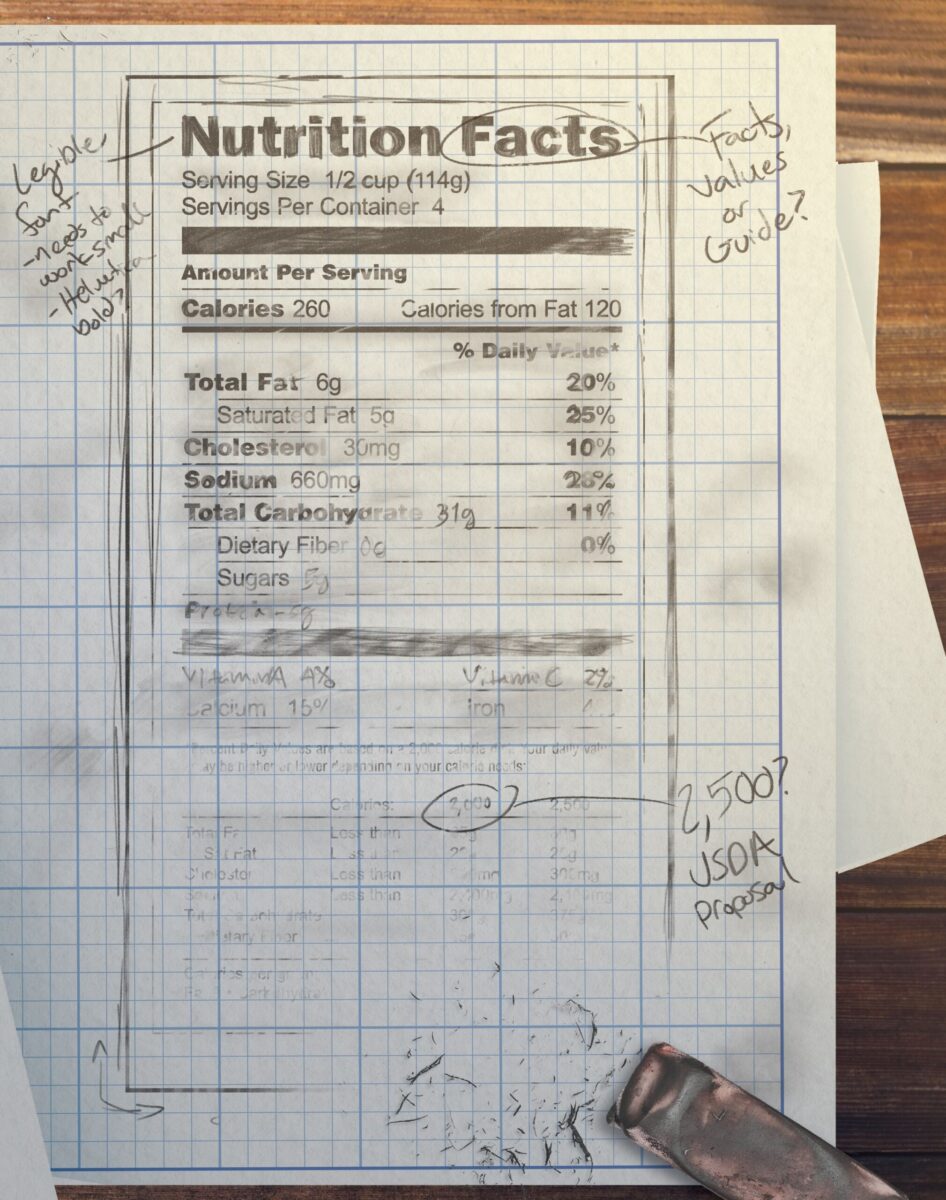
The law included a powerful provision — packages had to have a label that listed nutrients in the context of a daily diet. Among other things, consumers would know the amount of fat in each food item. The FDA’s proposed label would spell out the percent of fat (and other nutrients) a person should eat based on a 2,000-calorie-a-day diet, a prospect that unsettled meat producers because it might lead people to eat less meat. (Meat typically has a higher fat content and more calories than other food.) Then-USDA Secretary Edward Madigan opposed it, setting up what would become a last-minute showdown between the FDA and USDA.
By coincidence, Kessler became head of the FDA the day Bush signed the labeling bill into law. Kessler’s focus, as well as that of other FDA policymakers, centered on the nuts and bolts of the law — crafting arcane rules to regulate manufacturers’ claims and to define terms such as “low fat” and “high sodium.”
But Hubbard, who had long been involved in the FDA’s ongoing food regulation efforts, foresaw the label would be the keystone of the new law and the public face of the FDA’s vast framework of behind-the-scenes rules. He believed it would become a talisman that would have a kind of magic power to influence shoppers to make healthy food choices.
In an early meeting with Kessler and other FDA officials, Hubbard said he told the group, “ ‘You guys need to understand that in the end, when we’re all done with this, there needs to be a label, a physical thing,’ and they’re, like, ‘Whatever. It’s just a bunch of numbers.’
“And I said, ‘You guys don’t understand. This thing’s going to be important.’ It took them a while to get around to seeing that,” Hubbard recalled.
“A dogged focus”
The news about red M&Ms caught Mande’s attention. It was 1976, and he was a junior at the University of Connecticut. The FDA had just banned human consumption of Red Dye No. 2, the most common red food dye. The red candy discs, which reportedly may not have used the dye, vanished nonetheless, until a decade later when a new tinge could be formulated. Mande’s coursework mostly focused on political science, but he wondered why the government would want to micromanage the color of candy. “I took a nutrition class to learn more about it, and it snowballed from there,” he said.
When Mande came to UNC in 1980 to earn his master’s in nutrition and epidemiology, his adviser was a young professor named Barry Popkin, who today is the W.R. Kenan Jr. Distinguished Professor in the department of nutrition at the Gillings School of Global Public Health.
Hubbard said he told the group, “ ‘You guys need to understand that in the end, when we’re all done with this, there needs to be a label, a physical thing,’ and they’re, like, ‘Whatever. It’s just a bunch of numbers.’ And I said, ‘You guys don’t understand. This thing’s going to be important.’ It took them a while to get around to seeing that.” (Illustration: GAA/Haley Hodges ’19)
“Jerry was always outside the box. He’s always been a pusher. He’s a change person,” said Popkin, who consults with foreign governments on the new push for front-of-package food-warning labels.
Once Mande received his master’s, he headed to Washington to take a job as a legislative assistant in Gore’s office. Kessler knew about Mande’s nutrition expertise and soon lured him to the FDA. Once at the agency, Kessler said he told Mande, “ ‘We have to implement this law. Why don’t you go sit in the meetings and pick some aspect of it to lead?’ ”
Mande, who is now CEO of Nourish Science, a Bethesda, Maryland, public health policy nonprofit, said he realized creating what would become an iconic label for food packages would be an opportunity to nudge the consumer and companies to achieve the agency’s mission of improving public health.
In an early meeting, he pressed his colleagues to agree that the FDA needed to create a compelling label for consumers. “People were unconvinced. They didn’t get it,” said Kessler, who supported Mande’s vision.
“[Jerry] took on the food label format as his personal mission, displaying a dogged focus that sometimes infuriated his colleagues,” Kessler wrote in his 2001 book A Question of Intent. “His office soon became a small museum of food labels. Jerry was convinced that existing information was being ignored by consumers for two reasons: It was confusing, and it was hard to read. … Jerry reasoned that we should make sure it could be read.”
Kessler told him he had to overcome numerous hurdles. First, he had to convince the FDA’s lawyers that the law actually gave the agency authority to mandate a detailed design of a label. And then he had to create it.
Then there was the money problem. “We don’t have a budget,” Kessler told Mande. “We have a small art department. You can use it, but that’s about it. What do you want to do?” Kessler asked him.
Meanwhile, another problem loomed. The new law had a so-called “hammer,” a provision designed to deter regulatory foot-dragging. The law required the FDA to publish proposed rules by November 1991 and final regulations by November 1992, which was little time given the glacial pace of government rulemaking. Failure to comply meant that whatever proposals the FDA had — even if they were preliminary or unpalatable to industry or consumers — would become the law. The race was on, and everyone involved knew it.
What a 65-year-old can read
In Mande, Hubbard found a kindred spirit. The two men worked down the hall from each other and began to collaborate on a daily, even hourly, basis and made presentation after presentation to Kessler and Sullivan to update them on their progress.
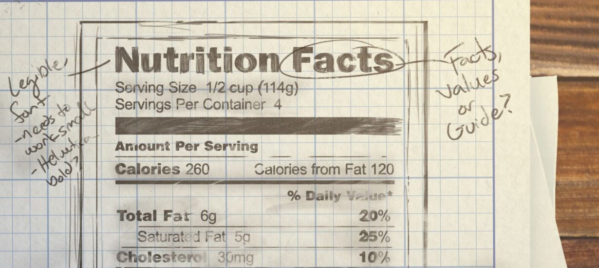
Working with the in-house art team, other staffers and FDA social science experts who ran focus groups, Mande oversaw creation of different versions of labels, with the goal of coming up with one that was easy to understand. Early incarnations had a tiny heading “Nutrition Information Per Serving” and listed calories and nutritional ingredients along with daily recommended values in humdrum vertical lists without any eye-catching design elements.
Something was missing in each version. Mande knew it from the first in-house design he saw. It was boring. It lacked pizzazz. Thanks to his training in visual design, he knew he needed outside help. He contacted graphic designer Burkey Belser, founder of the ad agency Greenfield Belser, who in 1978 created the bold bright yellow-and-black Energy Guide stickers for appliances. Belser agreed to work pro bono.
“I knew what I wanted to see. I needed someone who could keep coming up with new iterations. Burkey served that role,” Mande said. “There were so many meetings where I would come back to him and say, ‘I don’t like it,’ or we would do a consumer panel, and I’d come back saying, ‘I’m not liking what I’m seeing. Is there another way to do this?’ ”
Soon, better designs emerged. Bold-face type highlighted key terms. Tooling lines of different thicknesses separated items, making them easier for the eye to focus on. Words ran flush with the left and right sides of the label to create more order. All punctuation was deleted. “We need to make things big enough for people to read, but not so big that food manufacturers would say we were taking over their labels,” Hubbard said.
Early incarnations of the label were, for various reasons, not getting the job done. “I knew what I wanted to see,” Jerry Mande said. “I needed someone who could keep coming up with new iterations. Burkey [Belser] served that role.” (Illustration: GAA/Haley Hodges ’19)
space between lines, and kerning, the space between individual letters and characters, both of which affect the ease of reading.
“I was focused on type size, because the industry wanted really small type,” Hubbard said. “We went to experts and asked, ‘What can a 65-year-old man read on a label?’ They said, ‘It’s got to be 11- or 12-point type.’ The industry wanted eight point, which a senior citizen without glasses wouldn’t be able to read.”
New formats that were tested had headings in all capital letters and bold type such as NUTRITION VALUES and NUTRITION GUIDE. The image of a vibrant morning sun on the horizon with eye-catching rays crowned the latter headline, which seemed to be a winner. “We thought it would be a great image of health,” Belser told an interviewer in 2013. “But, in fact, people couldn’t tell whether the sun was rising or setting.”
Other designs incorporated colors that the team felt might better catch shoppers’ attention. Some thought colors could visually communicate the essential healthiness of a food’s ingredients. “Does red say ‘Don’t use this food?’ Does green say ‘This food is good,’ when it may not be a healthy choice?” Belser said. Ultimately the group nixed the colors, leaving a black-and-white design.
Hubbard and Mande also had to deal with input from focus groups that they didn’t agree with, and ultimately ignored. Consumers loved the prettier designs that included pie charts, bar graphs or the rising sun, but they disliked the stark, bold version the FDA ultimately chose.
“It’s funny, because to this day, people say the label is difficult for consumers, because it relies on the concept of ‘percent daily value.’ It reduces how much you should eat of something to a percent,” Mande said. “The problem was that consumers liked the more graphic versions, but they seemed to have less understanding of what they communicated. We faced this choice: Do you go with the one consumers like, or do you go with the one they can use the best?”
One sentence
Sullivan and Kessler approved the design Hubbard and Mande backed. In early November 1992, the FDA’s 5,000-page revised rules on food labeling, including the proposed label itself, was ready to be published in the Federal Register, the daily journal of new government regulations, and was put out for display for pre-publication viewing by the public. The FDA regarded the label’s graphic format not as mandatory but as highly recommended for food manufacturers to follow.
Almost immediately the Bush White House told the printing office to remove the rules from public viewing. USDA Secretary Madigan had complained the FDA’s label was based on a daily diet of 2,000 calories. He proposed 2,500 daily calories, a figure more favorable to the meat industry because it would allow for the consumption of larger portions of fat, and, by extension, meat.
Neither the FDA nor the USDA was willing to compromise. That meant the decision went to Bush just weeks after his November loss to Bill Clinton. If he declined to personally intervene in the dispute, the rulemaking process would have been upended because of the law’s hammer provision, which was soon to take effect.
Hubbard wanted no last-minute wrangling to thwart the FDA. After more than 20 years in Washington, he knew that the levers of power came in many forms. For months he had quietly worked to lay the groundwork for his agency’s victory, and he wanted to see it through.
“He was quite the operator in the Washington system and the executive branch in particular,” said Mike Taylor, who was the FDA’s deputy commissioner for policy at the time. “He was a creative strategist, a free spirit with incredible initiative and ingenuity. He figured out ways to work within the system to get things done and did stuff that, had he asked me for permission, I probably would have had a hard time letting him do.”
But Taylor said he was thankful Hubbard massaged the typical rulemaking procedures. For months Hubbard had worked his contacts with food writers, reporters and trade associations to run stories favorable to the FDA. To motivate food companies to accept the pending rules, he told reporters the incoming Clinton administration might push for stricter regulations, “something they would really hate,” Hubbard said.
Hubbard said he dished quotes on background to one reporter and the two argued over how Hubbard would be identified in the story. The reporter agreed to make Hubbard’s quotes seem as if they were said by three different government sources, he said. For one quote, he was an FDA official. For another, the reporter attributed Hubbard’s words to an official in the Department of Health and Human Services, which was accurate because the FDA is part of the larger HHS. A third quote came from an unnamed senior HHS official.
“When an agency needs to get something to the attention of the public, you’ve got to work it. You’ve got to be talking to people, because otherwise, to the public, this is just inside baseball,” Hubbard said. “In the end, it paid off because it created a lot of public support via all this media attention.”
The night before Sullivan and Madigan met with Bush in the Oval Office in late 1992, the president’s press secretary, Marlin Fitzwater, called Hubbard to ask whether the press was following the issue. Hubbard and Mande assembled a packet of news stories written about the label and sent it to the White House.
“The next morning when the president asked Fitzwater if there’d been any media attention to this issue, I later learned that Fitzwater said, ‘Yeah, I’ve got this whole sheaf of news articles, and they all favor the FDA,’ ” Hubbard said.
“Now I think that’s a big deal,” he continued. “I think that really helped. To me, all that effort to put it out in the public sphere paid off months later in that one sentence Fitzwater said to the president.”
The day before the meeting, Hubbard received another windfall. The USDA asked the FDA to create and present to Bush a version of the label that showed different calories from those on the FDA’s label, giving the FDA the power to design the label the USDA wanted. The FDA sent the White House a total of seven versions of the FDA and USDA labels.
“The USDA label was all caps, words run together, small type,” Hubbard said. “Here’s a guy who just lost his election and is not an expert and is asked to make a decision and is flipping through pages. We hoped we did a good job with design and that his eye would be attracted to the one we designed. The version he picked was exactly the one we wanted.”
More than 30 years later, Mande’s memory differs. According to him, White House Deputy Chief of Staff Robert Zoellick emerged from the meeting with a version of the mockups that had been cut-and-pasted together, saying, “The president expects to see a label that looks like this,” referring to the FDA-designed labels. With that, Bush became the first occupant of the Oval Office to personally intervene in an FDA policy matter since Theodore Roosevelt overturned a ban on saccharine in 1908.
Until the moment Bush picked a format, it had been unclear whether the FDA had the authority to require a specific graphic label design. But Bush, as head of the Executive Branch, made that argument moot, and everyone in government and industry had to comply.
Keep it simple
From the moment the label hit store shelves in 1994, it became a hit. Its thin, black wraparound border set off manufacturers’ messaging. Thick lines separated micro-nutrients such as minerals and vitamins from macro-nutrients such as fat and carbohydrates.
“The problem was that consumers liked the more graphic versions, but they seemed to have less understanding of what they communicated. We faced this choice: Do you go with the one consumers like, or do you go with the one they can use the best?”
— Jerry Mande ’83 (Illustration: GAA/Haley Hodges ’19)
Comic strips such as Sally Forth and Blondie cracked jokes about the label. When asked in the grocery store what a label says, Blondie replies, “Sodium, sugar, fat. That’s just what I want.”
“In the end, its success is due to its simplicity,” said Mande, who estimates that the FDA considered three dozen versions of the label before the final one was chosen.
The National Endowment for the Arts honored the label in 1995 with a design award. The same year, it received a Presidential Design Award along with honorees that included the U.S. Holocaust Memorial Museum.
“There is a masterpiece of information architecture printed on every food package sold in the United States,” wrote Italian designer Massimo Vignelli in American Institute of Graphic Design’s magazine in 1996. Calling it “the best piece of graphic information” in the past 20 years, Vignelli hailed the label as “a clean testimonial of civilization, a statement of social responsibility, and a masterpiece of graphic design.”
From the standpoint of changing Americans’ eating habits, for all the acclaim the label received, its impact has been modest at best. Obesity rates have about doubled, and the percentage of those with diabetes has tripled. “Existing labels don’t have any impact on purchasing,” said UNC nutrition professor Popkin. “Only a very tiny percent of people read them.”
Asked if the label has provided a beneficial service to Americans, Popkin replied, “Absolutely. They made a serious impact at the time.”
In 2016, the FDA gave the label a bolder look. It changed serving sizes, and it fixed what had been an oversight by adding sugars to the ingredients list.
Vignelli found one thing odd about the original label. “The only thing that strikes me as strange is the anonymity of its authorship,” he wrote.
That was intentional, Mande said. “The way you get things done in government is not to associate your name with it. You give someone else the credit,” he said. “Bill Hubbard is an extraordinary figure. This wouldn’t have happened without his ability to work the bureaucracy.”
“In the grand scheme of things, I was just a worker bee. It wasn’t just me and Jerry; it was a group of people who did it,” Hubbard said. “That’s the way government works.”
Hubbard now consults with the Biden administration on what may be a more eye-catching front-of-package label. A decision on this new attempt to encourage Americans to eat healthier foods may be announced later this year. Whatever happens, Hubbard knows one thing for sure: “When you put something on several billion packages a year, it gets noticed.”

Thanks for reading the Carolina Alumni Review
Carolina Alumni members, sign in to continue reading.
Not yet a member? Become one today.